简体中文
繁體中文
English
Pусский
日本語
ภาษาไทย
Tiếng Việt
Bahasa Indonesia
Español
हिन्दी
Filippiiniläinen
Français
Deutsch
Português
Türkçe
한국어
العربية

How To Calculate Currency Correlations With Excel
摘要:Correlations will vary and alter over time, as you've read. As a result, keeping track of current coefficient strengths and directions becomes even more critical.
Correlations will vary and alter over time, as you've read. As a result, keeping track of current coefficient strengths and directions becomes even more critical.
Currency correlations may be estimated in the privacy of your own home, using only you and your chosen spreadsheet programme.

We'll use Microsoft Excel to demonstrate this, but any software that uses a correlation formula would suffice.
Step 1: We're thinking you won't be conjuring up daily pricing data out of thin air, but will instead obtain it from the internet. The Federal Reserve is one source.
Step 2: Open Excel
Step 3: Copy and paste your data into a blank spreadsheet or open the data file you exported in Step 1. Get the previous six months!

Step 4: Now, arrange your data so that it resembles the image below or something close. You get to choose the colours and fonts! Have some fun with it. However, yellow might not be the greatest choice!

Step 5: Now is the moment to set a deadline. Do you want to see the currency correlation from last week? What happened last month? What happened last year?
This will be determined by the quantity of pricing data you have, but you can always collect more. We'll use the previous month as an example.

Step 6: Type =correl(EUR/USD, USD/JPY) in the first empty cell below your first comparison pair (I'm correlating EUR/USD to the other pairs, so I'll start with EUR/USD and USD/JPY).

Step 7: Then, choose the EUR/USD price data range of cells, followed by a comma. This range will be surrounded by a box.

Step 8: Select the price data range for USD/JPY after the comma, just as you did for EUR/USD.

Step 9: To compute the correlation coefficient for EUR/USD and USD/JPY, press the Enter key on your keyboard.

Step 10: Steps 5–9 should be repeated for the remaining pairings and time periods.
When you're finished, you can use your new data to make a table that looks like this. That's pro-status!
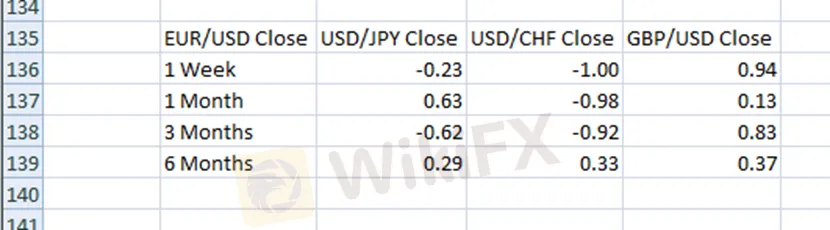
The trailing periods of one week, one month, three months, six months, and one year give the most comprehensive perspective of currency pair correlations.
However, you must choose which or how many time periods you want to examine.
While updating your data every day could be excessive, unless you're a currency correlation junkie, updating them at least every other week should enough.
You may need to get out more and pick up a hobby if you find yourself manually updating your currency correlation tables on Excel every hour.
免责声明:
本文观点仅代表作者个人观点,不构成本平台的投资建议,本平台不对文章信息准确性、完整性和及时性作出任何保证,亦不对因使用或信赖文章信息引发的任何损失承担责任
热点资讯
外汇市场中如何确定趋势市场
外汇交易经验:背离不是交易信号
外汇交易背离规则
不同的保证金通知和止损水平对外汇交易影响
外汇交易追加保证金水平100%,止损水平50%
外汇交易账户怎么开,外汇交易平台开户流程?
外汇点数是什么?外汇点值怎么计算?
外汇交易:斐波那契比率
外汇交易:如何在支撑和阻力下使用斐波那契回撤
外汇交易:如何利用移动均线判断趋势方向?
汇率计算